
Reflective
Report
To
make a successful business in
the artistic field,
creativity and innovation in
relation to the
enterprise are very
important. Creativity is the mental ability
to come up with original and unique ideas, while innovation is the
process of transformation of said ideas into something real and
useful. The two concepts
need to walk side by side and
are used by
enterprises
to offer services to consumers (in our case, clients). Creative
minds such as artists can still share their work without companies
being involved, thanks to media such as the
Internet that made it very
easy to be noticed by prominent
groups of people around the world. However,
having said that, working
alone is always harder: there are hundreds
of very good artists all
around the world,
some of them with huge
potential. So, the main
distinction between them would be how
they approach the world. Someone who is more creative and innovative
would surely have more chances to work in companies and live
more comfortably thanks to their work.
My
university course is about Animation and Illustration,
but I would prefer to focus on the one I intend
to master, illustration. The illustration sector is so broad that
it could easily include every
other artistic field within.
I would like to become
a character
designer rather
than an illustrator, but I
will talk more about that later.
To
be original and have innovative ideas is a challenging tasks for
today's illustrators, since the competition is very strong.
People have seen so many different types of art that
they are used to it by now. To really reach someone inside and
trigger something in them, it takes more time
day by day.
The
dream job for me would be character designer. I love
to draw people, to create
characters with different
cultures, stories, backgrounds, races, and
even worlds. I would like to
illustrate stories by other authors, to make the transition from word
to drawing. Character
design can also be applied to films,
TV series, cartoons and video games. The ideal
branch for
me would probably be working
as a character designer for video games.
Looking
back at my skill audit from the start of the academic year, I have
developed a sense of seriousness I didn't have before. I didn't
understand the
complexity of enterprises or the extent
of the illustration field. I learned that I needed more than just a
good hand to go out there and make a living from
what I am really passionate about. Even if I already used social
media to share my works, I learned that using
them more professionally could benefit my career. I also tried using
other drawing programs
and changing
colours and styles, even thought I'm still working on it. I acquired
more self-esteem in what I do, and I learned that clients need
me to believe that I'm confident in
what I'm doing.
I found
the time planning part of the module a bit challenging, since I never
panned or organized my activities too much. I realized planning what
I want to do for the rest of the day/week has a very calming effect.
If I have control of what I can do, I feel more confident that I'm
doing everything right. I started to use a website called Trello,
suggested by a classmate during one of the sessions in class, where
one can plan their activities. I started planning my time for this
module and the other two just around the end of the semester, and I'm
not happy with that. I think I didn't do a great job at planning, but
at least now I know what to do for the next modules. I want to be
more precise and organized, so that I have a schedule to follow. One
of the charts I created before using Trello was the following one,
it's really simple but I managed to follow it.

In the
first week we had to complete a Skill Audit by
creating an online blog and
a Twitter account, and thinking about how creatives can benefit from
social media. As
I couldn't start the term in time, I worked on this project on my
own.
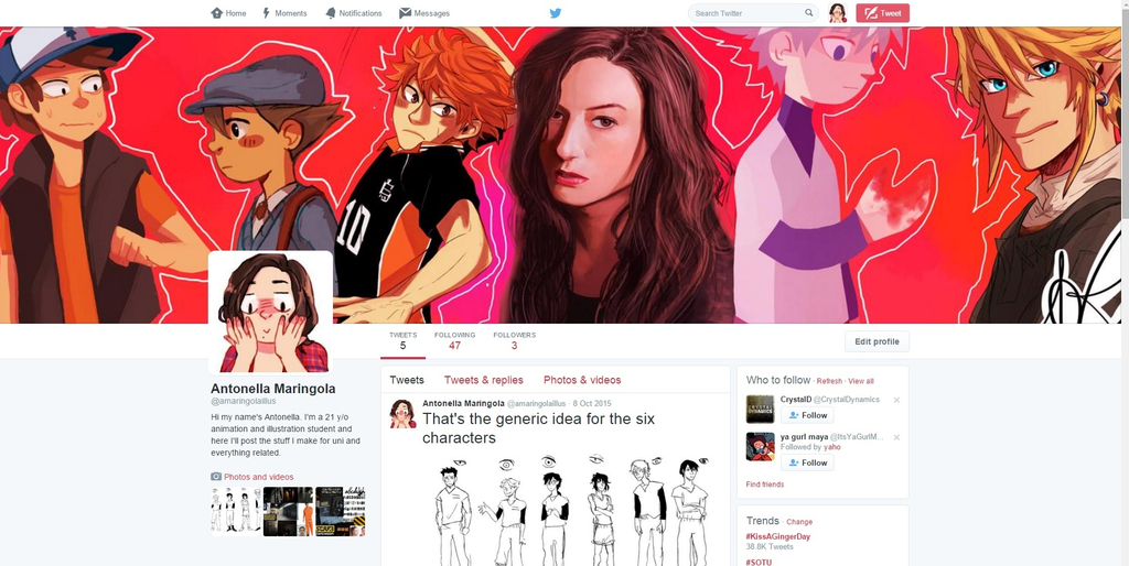
This is
a screenshot of my Twitter account:
And this
one's of my Wordpress blog:
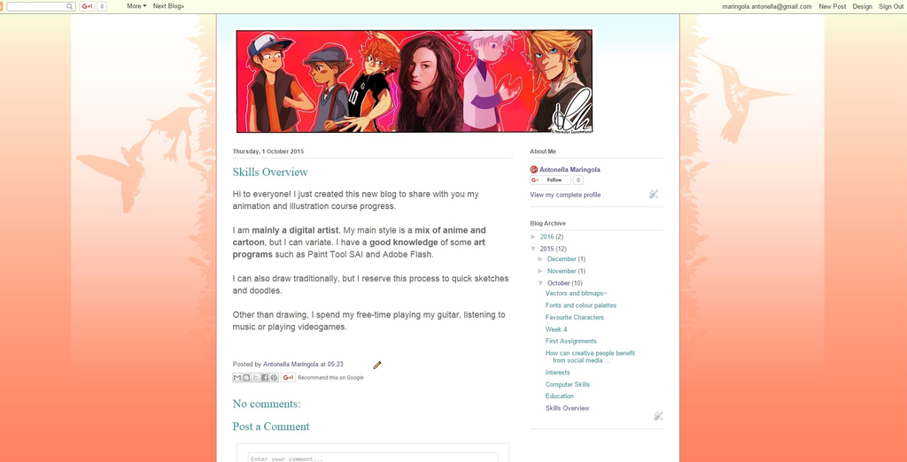
The
header picture
is a collage of some of my
previous works, just to show what I can do and my styles.
A
Skill Audit is a list of
professional skills and experiences that I already had attained. I
don't have much working
experience in the animation
or illustration field, so I
tried to express myself in other ways.
It's basically a short bio of who we are and what we can do. In the
first post on my blog I just shared
a skills overview,
talking about what I do and what I like to do during
my free time.
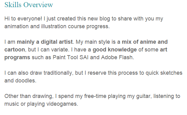
My first post is quite informal but I tried to be as clear as possible.
As
for the next task, the question we had to answer was “How
can creative people benefit from social media & blogs?".
My answer was:
This
question is interesting. Internet is nowadays an essential tool if
you want to be seen by the majority of people in a fast way, It's a
pretty straight-forward method to look for creative contents.
More and more creative people (illustrators, musicians, actors, animators) decide to create a social account to share their thoughts and opinions about everyday matters (or to show their works and works-in-progress).
It makes it feel like they are more approachable by the others, since everyone can see, comment and share.
In any case it's easier to "talk" to strangers behind the screen; there's an invisible barrier that can really helps insecure people.
It's so easy to just search your favourite artist, look at his works, videos, interviews. I totally think this potentially is the most creative period we had in years.
Today the artist can actually earn money by selling his works online; there are many websites (likeKickstarter or Patreon ) where people can support you by giving you money for your ongoing projects. This is called crowdfunding.
Here's an interesting article by Leanne Regalla about 49 Creative Geniuses Who Use Blogging to Promote Their Art .
In
the second session the tutor
told
us about the
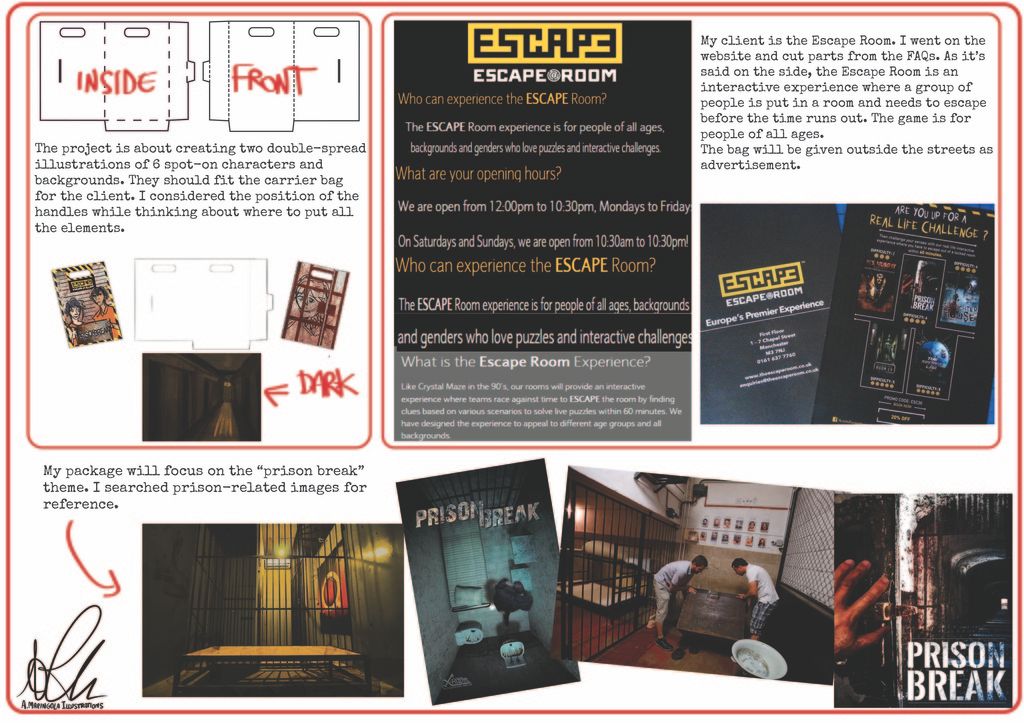
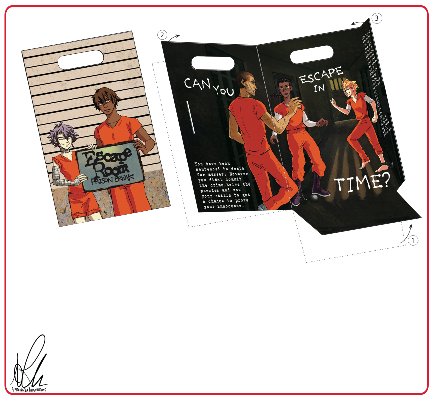
practical brief of the module. The
assignment was about creating a
minimum of six characters and
backgrounds to be put outside
and inside a package. The package had to promote a public attraction
or an
establishment. After reflecting on the assignment, we were asked to
choose
which attraction to advertise and to do some primary research. The
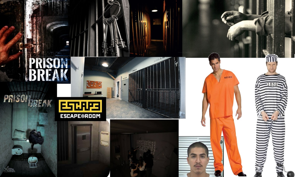
one I picked was the Escape Room.
I really appreciate mystery and
puzzle-solving games. I
created two digital mood-boards: my
early research included some pictures of an actual Escape Room, the
original logo and some
fonts.

After
that I decided I wanted to focus on the Prison Break
theme for my Escape Room, so I created a more specific mood-board
that would fit said theme.
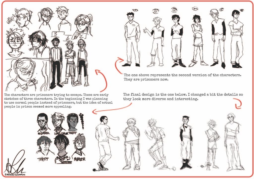
On
week three we
talked about character design and how to create an effective design
for our characters. I really enjoyed this session, since it
approached what I'd like to
do as a job in
the future. I started to sketch the characters for my project and I
had fun doing it.
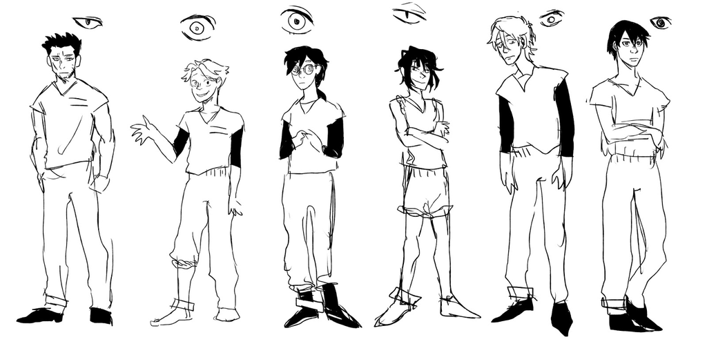
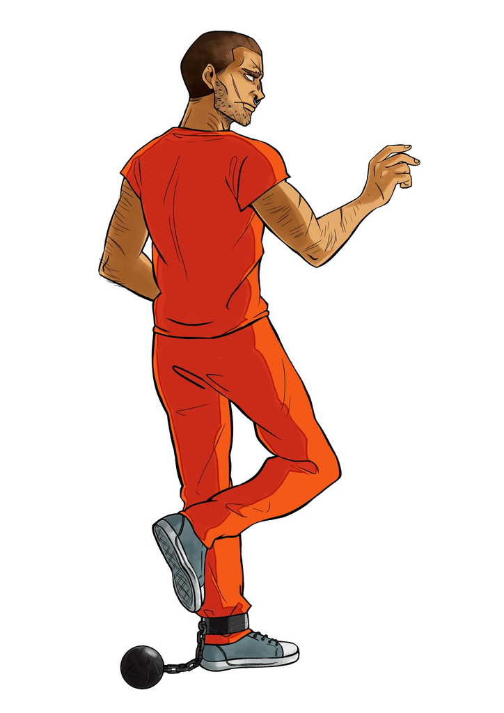
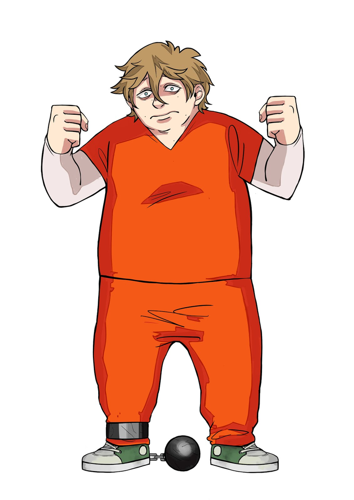
This is the first version of my characters. Since the theme was Prison Break, the characters are prisoners. I tried to make them as appealing as possible and I was satisfied with the direction the work was taking.
The
following week we discussed
our choices
in a group meeting, where we gave and received feedback from each
other. After that, my ideas about the characters changed a bit, since
my attention was brought to
things I hadn't considered.
With clearer ideas,
I made the final sketches.
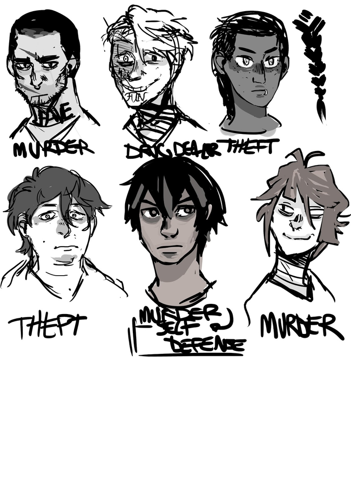
I
like this
new version more than the old one. The
characters have a distinct
personality and are much
more diverse. I tried to
include younger and older characters, people of colour and
different body shapes.
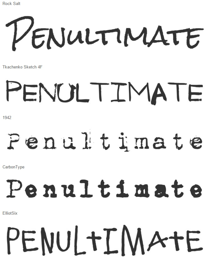
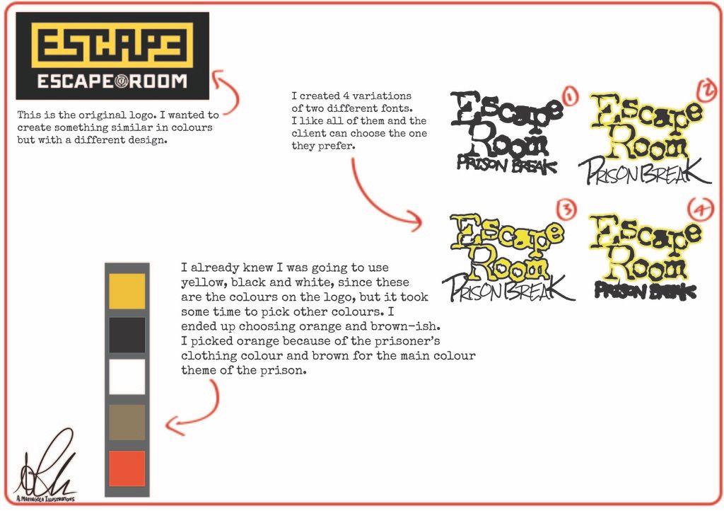
On
week
five we
talked about choosing
a font.
We were required to use
a maximum of two typefaces for
our design. These
are some original fonts I found on
Font Squirrel:
We
also had to find a proper title and fictional content list for the
pack, write a paragraph that describes
the attraction and place it inside the package. For
the title I thought about something like “ESCAPE ROOM:
Prison Break”. The content
list I wrote was the
following:
“Like
Crystal Maze in the 90’s, our rooms will provide an interactive
experience where teams race against time to ESCAPE the room by
finding clues based on various scenarios to solve live puzzles
within 60 minutes. We have designed the experience to appeal to
different age groups and all backgrounds.
The
ESCAPE
Room
experience is for people of all ages, backgrounds and genders who
love puzzles and interactive challenges. Please note that children
under the age of 12 will need to be accompanied by an adult. To
date, over 500,000 customers have enjoyed our ESCAPE
Room
experience and we hope to share this with you too!
PRISON
BREAK
You
have been sentenced to death for murder. However, only you know you
didn’t commit the crime. Solve the puzzles, discover the hidden
objects, manipulate the prisoners and guards, use your skills and do
whatever it takes to escape, and maybe then you’ll get a chance to
prove your innocence.”
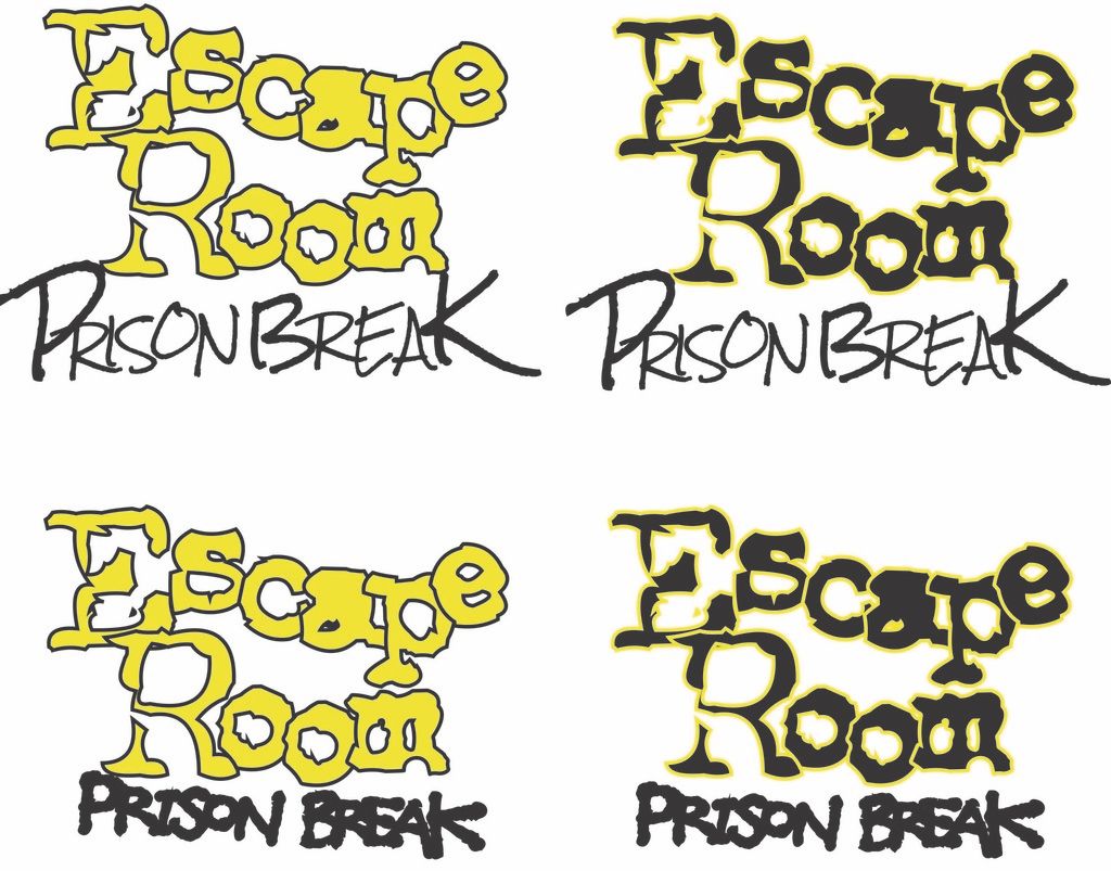
After
that we had to use Adobe Illustrator to collect some font
combinations for our theme. I
decided to go with these four:
Furthermore,
we discussed colour palettes and had to find one to use for our
design. The palettes had to contain from three to five colours and
every colour had to have a meaning. After searching the best
combination, I opted for this one:

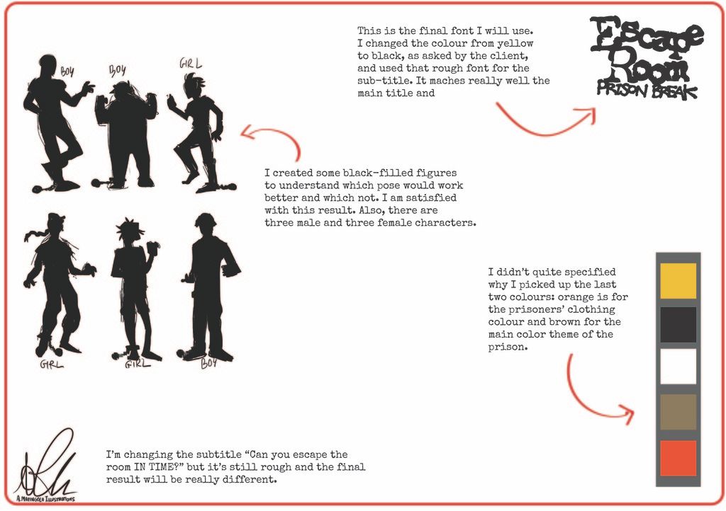
Yellow,
black and white are the colours showed on the original logo from
Escape Room, so I already knew I wanted to use them. Orange is the
colour of the prisoners outfit, and grey/brown is the colour of the
prison.
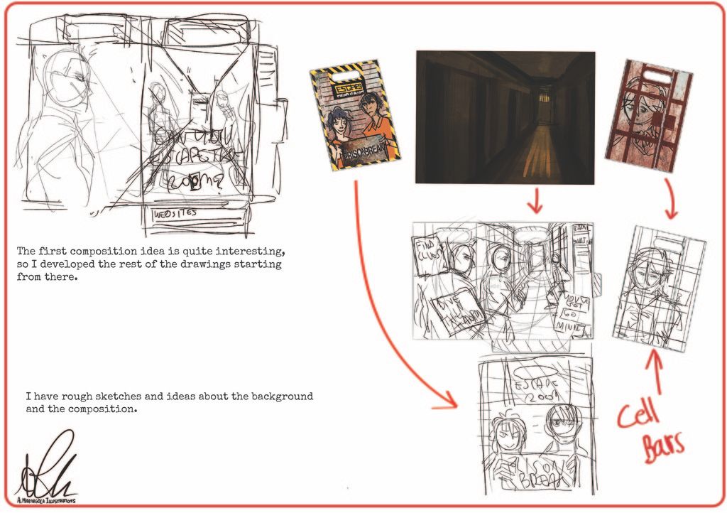
For
the week after
we were asked
to prepare scamps to show the
client our choices in
character design, font and colours. So I prepared a
few PDF pages to send them.
We had to then explain the difference between vectors and bitmaps, using our blog. Basically, vectors are made of objects while bitmaps are made of pixels. The difference is that vectors are scalable while bitmaps become blurry if the size changes. Vector images are suited for graphic advertisements or for spot-on illustrations. But, sometimes, vector illustrations result too plain. Bitmap images can look realistic, so when creating a digital painting the more appropriate format is bitmap.
On week
seven I had the client review appointment. The client gave me
feedback and a few things to change. So, after changing them, I sent
a new scamp with the corrections:
After
the client's feedback, we spent the next
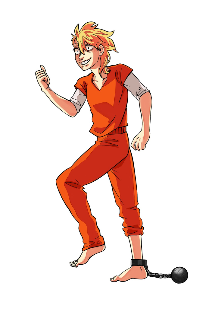
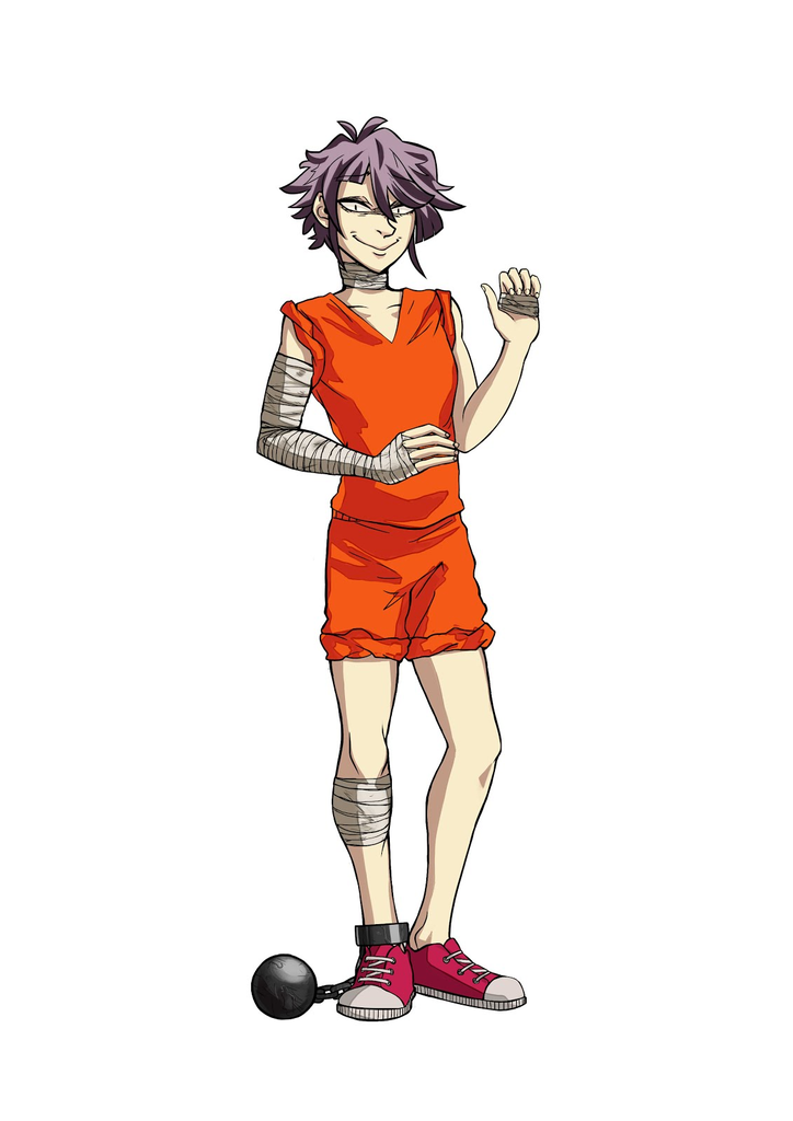
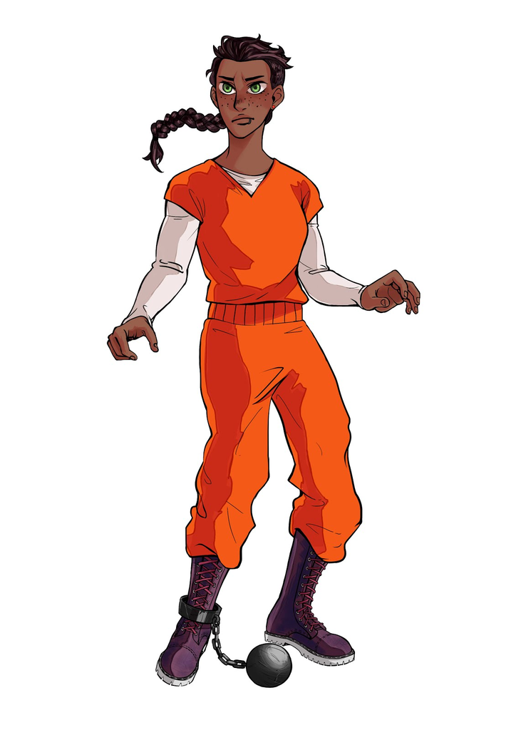
6 weeks on the digital production of the final artwork. My
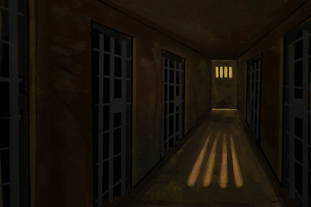
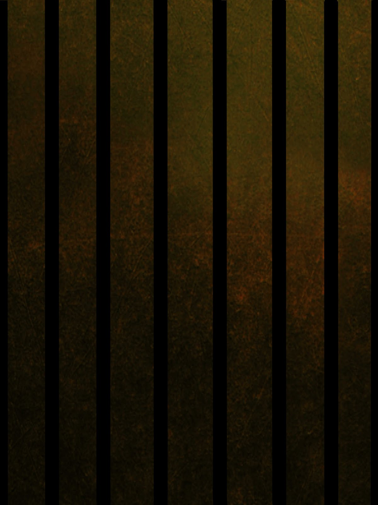
characters and backgrounds are the following:

Other
than finishing our drawings, we had to practice with Adobe
Illustrator tools and check if every compulsory task was completed.
We also had to prepare our artwork for print and see that every
technical requirement was met before submitting the package.
The
deadline for the practical part of the module was set on week 13. We
needed to send the client a preview of how the actual package would
be, after print:
The
final two weeks were spent writing the reflective report for this
module.
Since I
neglected some of the compulsory tasks when I had to complete them, I
covered what I left undone in one of my latest posts. Some of the
questions were about bleed and margins, RGB and CMYK and the meaning
of dpi.
Overall,
I really enjoyed this module. It's been different from every other
module I've done since I started university, and
it was helpful in understanding
more about the workfield
in my sector.


